В днешния мобилен свят имате нужда от уебсайт, който работи безупречно на всички устройства. Освен това, това вече не е лукс – това е необходимост. Независимо дали посетителите сърфират на настолен компютър, таблет или смартфон, уебсайтът ви трябва да изглежда страхотно. Също така, той трябва да работи перфектно на всички размери на екрана.
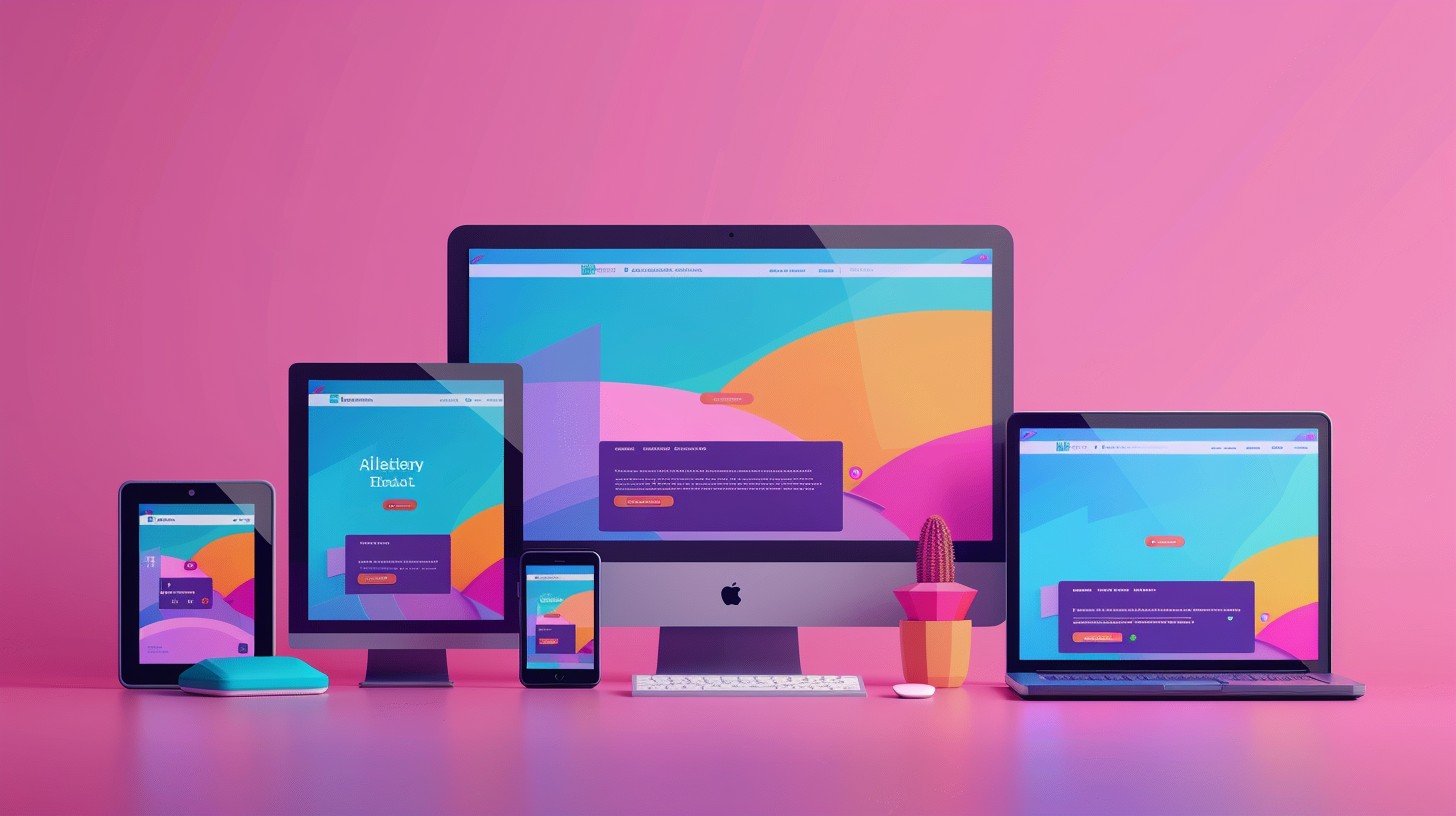
Тук идва адаптивният уеб дизайн. В THE FOX ROOM създаваме уебсайтове, които осигуряват оптимално потребителско изживяване на всяко устройство. Следователно, посетителите ще останат по-дълго на сайта и ще се ангажират с него.
Нека разгледаме защо адаптивният дизайн е толкова важен и как гарантираме отлично изживяване за всички потребители.
1. Защо удобните за мобилни устройства уебсайтове са от съществено значение
Все повече хора използват смартфони и таблети за сърфиране в мрежата. Поради това вашият уебсайт трябва да е удобен за мобилни устройства.
- обилен трафик: Според Statista мобилните устройства генерират над 55% от глобалния уеб трафик. В резултат, бизнесът, който не е адаптиран, може да губи клиенти.
- Google приоритет: От 2015 г. Google дава предимство на сайтовете, удобни за мобилни устройства. Следователно, неподготвените сайтове могат да загубят видимост и потенциални клиенти.
- Подобрено потребителско изживяване: Адаптивният сайт автоматично настройва оформление, изображения и съдържание спрямо екрана. Също така, това улеснява навигацията и намалява отпаданията.
- Повишени проценти на реализация: Оптимизираният за мобилни устройства сайт увеличава времето на посещение и ангажираността. Например, потребителите са по-склонни да попълнят формуляр, да направят покупка или да запазят час.
2. Въздействието на мобилното сърфиране върху бизнеса
Мобилното сърфиране расте, затова бизнесът трябва да го приеме, за да остане конкурентен.
- Мобилно пазаруване: 67% от потребителите купуват през мобилни устройства (Google). Ако сайтът не е мобилен, може да губите продажби.
- Mobile-First индексиране: Google вече използва мобилната версия за класиране и индексиране. Следователно, неоптимизираните сайтове може да се класират по-ниско.
- Степен на отпадане и ангажираност: Според Нийл Пател 40% от потребителите напускат сайт, ако се зарежда повече от 3 секунди. В резултат, бързият и отзивчив сайт задържа посетителите.
3. Как работи адаптивният дизайн
Адаптивният уеб дизайн използва гъвкаво оформление, което се приспособява към различни размери на екрана..
- Fluid Grid Layouts: Вместо фиксирани елементи, сайтът използва гъвкава мрежа. Следователно, всички елементи – текст, изображения, бутони – се преоразмеряват правилно.
- CSS медийни заявки: Те откриват устройството и прилагат подходящ стил. Така че, съдържанието изглежда оптимално на телефони, таблети и настолни компютри.
- Гъвкави изображения: Картинките се преоразмеряват динамично. Освен това, оформлението остава стабилно, без забавяне при зареждане.
- Адаптивна навигация: Менюто на мобилни устройства често е опростено. Също така, хамбургер менюта и лесни за докосване елементи улесняват потребителите.
Тези техники гарантират безпроблемно и ангажиращо изживяване за всеки посетител.
4. Как гарантираме, че вашият уебсайт е напълно отзивчив на всички устройства
В THE FOX ROOM знаем колко е важен адаптивният дизайн.
- Тестване на различни устройства: Проверяваме сайта на смартфони, таблети, лаптопи и настолни компютри. Освен това, откриваме проблеми като неподравнени изображения, повредени връзки или бавно зареждане.
- Бързо зареждане: Оптимизираме изображения и код. Следователно, дори при бавни връзки, сайтът се зарежда бързо.
- Интерактивни елементи: Бутони и формуляри са лесни за докосване на малки екрани.
- Редовни актуализации: Нови устройства и размери се следят. В резултат, сайтът остава отзивчив и бърз.
5. Заключение: Значението на адаптивния дизайн за онлайн успеха
Мобилното сърфиране доминира. Наличието на адаптивен уебсайт е ключово за успех онлайн. Удобен за Мобилното сърфиране доминира. Затова наличието на адаптивен уебсайт е ключово за успех онлайн. Удобен за мобилни устройства сайт осигурява по-добро потребителско изживяване, по-високо класиране в Google и увеличава процента на реализация.
В THE FOX ROOM създаваме адаптивни уебсайтове, които изглеждат страхотно и функционират безупречно на всички устройства. Нашият Mobile-First подход, стриктно тестване и оптимизация за скорост гарантират отлични резултати.
Готови ли сте за уебсайт, който изглежда страхотно на всяко устройство?
Свържете се с нас днес, за да започнете проект за адаптивен уеб дизайн и да подобрите онлайн присъствието си.